Color (nonfiction): Difference between revisions
No edit summary |
No edit summary |
||
| (4 intermediate revisions by the same user not shown) | |||
| Line 12: | Line 12: | ||
<gallery> | <gallery> | ||
File:Superimposed Fraunhofer.jpg|link=Superimposed Fraunhofer|March 6, 2006: Steganographic analysis of the [[Superimposed Fraunhofer]] stamp reveals "seven hundred to eight hundred kilobytes" of previously unknown [[Gnomon algorithm]] functions related to [[Color (nonfiction)|color]]. These functions will quickly find application in the detection and prevention of [[crimes against light]]. | |||
File:Fluorescence chemistry.jpg|link=Chromo-Pee Olympics|[[Chromo-Pee Olympics]] champion urinates five distinct hues. | |||
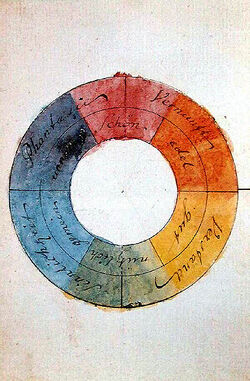
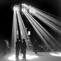
File:Light 1943.jpg|link=Light (nonfiction)|[[Light (nonfiction)|Light from 1943]] and color wheel from 1809: can their long-distance love survive? | File:Light 1943.jpg|link=Light (nonfiction)|[[Light (nonfiction)|Light from 1943]] and color wheel from 1809: can their long-distance love survive? | ||
</gallery> | </gallery> | ||
| Line 32: | Line 35: | ||
* [https://boingboing.net/2018/03/08/google-service-finds-artworks.html Google service finds artworks that share similar color palettes] @ Boing Boing | * [https://boingboing.net/2018/03/08/google-service-finds-artworks.html Google service finds artworks that share similar color palettes] @ Boing Boing | ||
* [https://picular.co/ Picular] - search engine for color | * [https://picular.co/ Picular] - search engine for color | ||
* [https://en.wikipedia.org/wiki/Pantone_448_C Pantone 448 C] - also known as the "The ugliest color in the world", is a color in the Pantone color system. Described as a "drab dark brown", it was selected in 2016 as the color for plain tobacco and cigarette packaging in Australia, after market researchers determined that it was the least attractive color. | |||
* [https://boingboing.net/2019/08/15/pantone-alignment-chart.html Pantone alignment chart] @ Boing Boing | |||
* [https://hyperallergic.com/304550/in-defense-of-the-worlds-ugliest-color-opaque-couche/ In Defense of the World’s Ugliest Color, “Opaque Couché”] by Carey Dunne (June 16, 2016) @ Hyperallergic Media | |||
[[Category:Nonfiction (nonfiction)]] | [[Category:Nonfiction (nonfiction)]] | ||
[[Category:Colors (nonfiction)]] | |||
[[Category:Light (nonfiction)]] | [[Category:Light (nonfiction)]] | ||
Latest revision as of 15:36, 18 August 2019
Color is the visual perceptual property corresponding in humans to the categories called red, blue, yellow, etc.
Color derives from the spectrum of light interacting in the eye with the spectral sensitivities of the light receptors.
Color categories and physical specifications of color are also associated with objects or materials based on their physical properties such as light absorption, reflection, or emission spectra.
Because perception of color stems from the varying spectral sensitivity of different types of cone cells in the retina to different parts of the spectrum, colors may be defined and quantified by the degree to which they stimulate these cells.
These physical or physiological quantifications of color, however, do not fully explain the psychophysical perception of color appearance.
In the News
March 6, 2006: Steganographic analysis of the Superimposed Fraunhofer stamp reveals "seven hundred to eight hundred kilobytes" of previously unknown Gnomon algorithm functions related to color. These functions will quickly find application in the detection and prevention of crimes against light.
Chromo-Pee Olympics champion urinates five distinct hues.
Light from 1943 and color wheel from 1809: can their long-distance love survive?
Fiction cross-reference
Nonfiction cross-reference
External links:
- Color @ Wikipedia
- Paint names selected by neural network @ Boing Boing
- Color Branding & Trademark Rights @ colormatters.com
- Google service finds artworks that share similar color palettes @ Boing Boing
- Picular - search engine for color
- Pantone 448 C - also known as the "The ugliest color in the world", is a color in the Pantone color system. Described as a "drab dark brown", it was selected in 2016 as the color for plain tobacco and cigarette packaging in Australia, after market researchers determined that it was the least attractive color.
- Pantone alignment chart @ Boing Boing
- In Defense of the World’s Ugliest Color, “Opaque Couché” by Carey Dunne (June 16, 2016) @ Hyperallergic Media


